Process Notes
Updates & Topics Needing Resolution:
Your existing site/home page is called a “Cover Page” which Squarespace often offers as a simple single page, a landing page option, or for short-time use. The styling I (MW) have been doing is intended to pull some of the design elements BB used in your original design. I did choose a slightly darker purple for header text, but it’s a shade that coordinates well.
Photos? Which ones do you want to add? Where should they appear?
Obviously if you have additional photos of you, or shots you’ve taken that will complement your text content well, we’ll use those. If you’d like to use free stock images, Squarespace has a relationship with Unsplash and we can use any of those, using some built-in tools, that you’d prefer. You can visit the site and search by term, if you’re interested in that option.
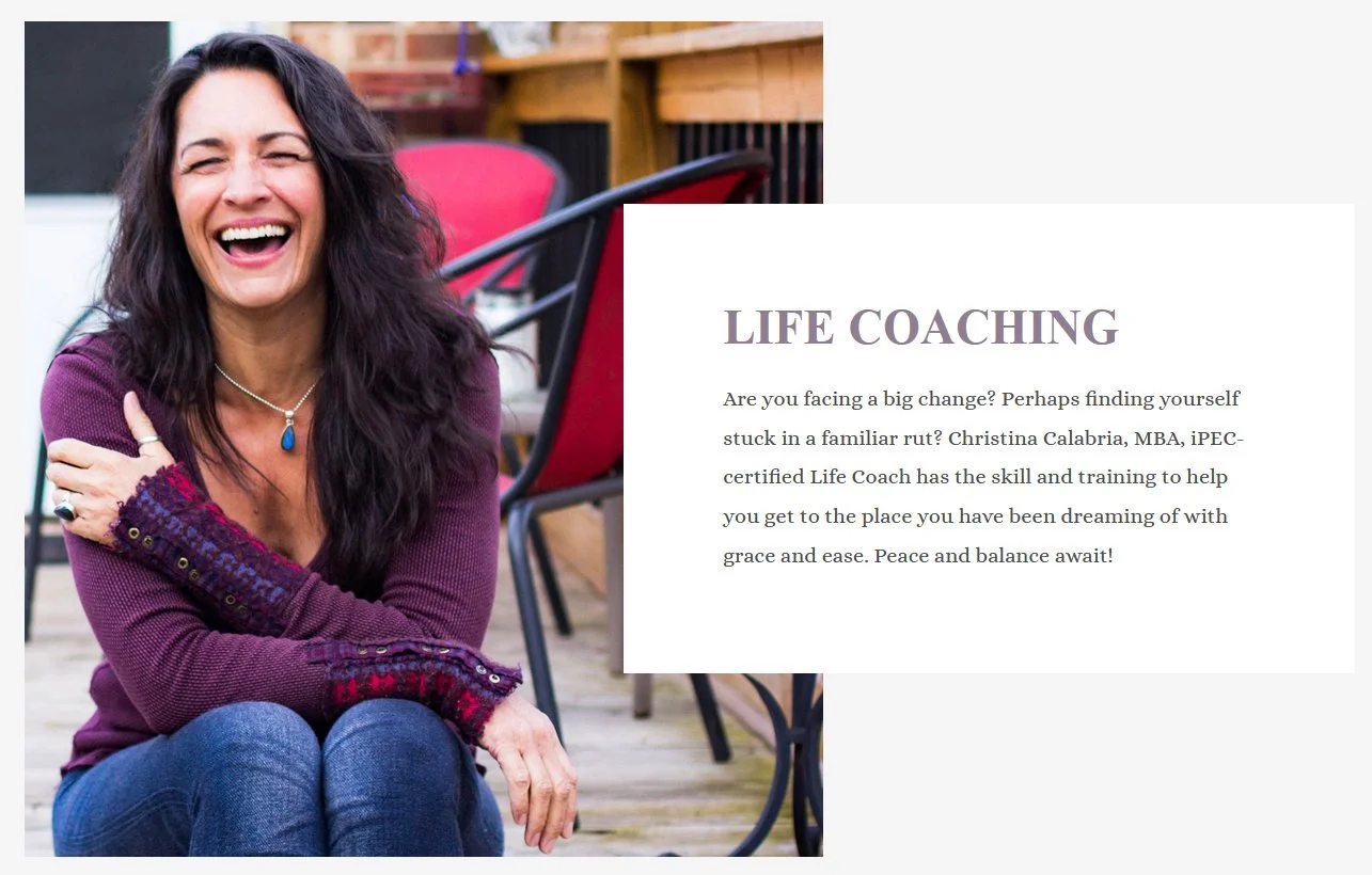
Meanwhile, click this thumbnail and you can see it larger, on a different page. This is just a setup using your existing content that illustrates one of the styling options you can use for photo presentation on your site, that you might not know about.
Contact (I’ve created this, though I didn’t change the built-in contact form embedded in your Welcome page. Please take a look and see what you’d like changed: intro text - I just made something up so you’ll want to personalize it - form fields, (I can remove or add, also reorder, or add descriptive text.)
There are additional options for your Contact page - emails can be captured in a form hosted on Google Drive which is a handy backup, if you’d like. For now I’ve just set it up to point to your email address.
Bio - new page we’ll add
Testimonials - new page we’ll add
Approach (name?) - possible new page to add
Logo - as you see, it’s in your header. now What I hadn’t given thought to, because the only websites I still work with have the names in their logos, is that you can either have a logo or a text header, but not both. So I’ve created this logo-inclusive graphic for you. We can discuss any changes you’d like me to make, (color of text, size, spacing, etc.,) but I wanted to put it in the site and see what you think, as you see it in context. It can’t be any larger, so hopefully the size works, too. OR, we could maybe make the logo itself larger and the text smaller. The size constraints are based on width. Ponder that and let me know.
Footer - What content would you like to appear in your footer? For the moment, I’ve added a link to your contact page, but that’s just so we’ll remember to make the updates before we launch the new pages. We’re going to add the iPec logo when you have the new one available for me to add. Maybe a copyright notice, too? Do you market your business n social media? We can add icon links if you’d like.
Favicon - I added one of these for you, too. It’s tricky to add a photo - especially such a tiny one based on a screenshot, such as this - beside bulleted text. But this might work. To the righ, there are two - the Squarespace one (which is what you’ll see when you’re logged in,) and your own (which is what visitors will now see when they come to your site. They’re itty bitty, but that’s how they are. Another visual to reinforce the professionalism of your site! Here’s more Squarespace info about them.
Look at the top of the page to see this “live” and in the wild!
SEO! For every page, and every photo as well, we’re given the opportunity to create SEO content and filenames. If you’ll write an SEO Title and SEO Description for each new page, I’ll add those for you. If you’re tired of writing, I’ve found that Gemini (and probably Chat GPT if you prefer,) does a good job of helping with that… I just give it the page content, then ask for help with those fields. It’s also good to add Alt Tags for all images, and I’ve done this for your home page photo.
Social Sharing Image - I did one of these, too. Here’s some info on what that’s all about.
I’m not sure about the margins of this template, but we can explore these… notice that your “navigation links” at top right, and logo in the left, expand wider than this content (except, interestingly, for the bit about favicons.) So before we launch your new pages, we can discuss your thoughts on this, and if you’d like your pages’ content to be wider, I’m sure we’ll figure it out! :)
Current Style Sheet Settings:
Take a look at these and see what you think we should do. I think 1 is awfully big and 3 is perhaps a bit small. I changed the fonts, but didn’t do much with sizes. (I did reduce Header 1 which was even larger, if you can image!) :).
Header 1
Header 2
Header 3
Body Text - This and most every other text on this page, too!